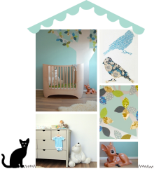
Mwah! I love xo-in my room‘s new candy circus cot in grey. But boy do I love their styling too.
Remember my mantra for nursery design – keep it simple? This image exemplifies what I mean by that. Of course this is a not real nursery, but you can keep your palette reduced – white with a whisper of grey, natural flooring – and let a feature wall or accent mural behind the cot take centre stage.
I love the combination of wallpaper patterns – artfully mismatched but unified by grey, and the contrast between pretty, delicate vintage florals and the unfussy, slightly raw look and feel of the cot. Well done Carina!
x
(image: xo-in my room)


Thanks Ursula, you’ve made my day! 🙂
I just love this picked fence inspired cot And you are so right their styling is spot on! x
Love the pared down simplicity of this cot with its little strokes of grey. the mismatched wallpaper bunting is such a genius idea. x
so pretty! love it…