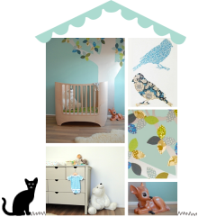
This romantic and eclectic girl’s bedroom belongs to Linnéa who is 1.5 years old. She lives with her family in Trollhättan, Sweden.
Linnéa’s bedroom was designed by her mum Charlotte, who works as a nurse in a hospital near Gothenburg. She loves decorating and frequently posts pictures of her house and her children’s rooms on Instagram. I love her pretty use of soft colours and the romantic detailing in Linnéa’s room, which is modern and not too sweet. The star of the room is the cute nook she’s created under the rafters – wouldn’t you want to curl up with a book in there?
Charlotte’s advice for designing kids’ rooms is to use different shades of the same colour plus one accent colour to achieve a harmonious space. Mix old and new to inject life into the room and make it more interesting.
+ + + + + + + + + + + + + + + + +
Time to learn a bit more about Linnéa now! Tell us Linnéa…
♥ What is your favourite food? Spaghetti and sausage.
♥ What are you into right now? I love playing with my dolls.
♥ Your favourite book? I love looking at the pictures in my mum’s old Elsa Beskow books.
♥ What is your favourite colour? I don’t know yet.
♥ Your favourite animal? A dog – we have one at home!
♥ What do you like best in your room? My cozy corner – I love climbing in there and throwing all the cushions out!
♥ Which is your favourite duvet cover? The one with the pink trees from Ferm Living.
♥ Your favourite pyjamas? I love them all.
Thank you Linnéa, it was a pleasure to meet you!
(photography by Charlotte Bokstedt)
 This month you can read my tips and advice on how to decorate a gender neutral nursery in Baby London’s November/December issue. Aside from tips there’s a section with my pick of the the prettiest gender neutral nursery decor and accessories, so if you’re looking for inspiration get your copy now!
Update: You can now read the article on my Press page here.

Art prints for kids rooms are often the inspiration or starting point for my kids’ room designs, but they can also add that finishing touch to bring a room together. Time then to share another favourite of mine: Rylee & Cru. This relatively young brand does gorgeous clothes for tinies, but also has small collection of dreamy art prints for children with a soft vintage feel. This Fox print is just too cute – check out more of their collection here.
PS – if you are looking to find some original art to invest in, the ‘affordable’ arts fairs are hitting London this autumn, and Mr Fox magazine has just published excellent advice from art expert Sarah Ryan, founder of New Blood Art here.
 Wall shelves to display books or trinkets are a great way to personalise a kid’s room and create a cosy corner near a bed or over a desk. Find out where to buy my pick of the coolest wall shelves for kids plus some styling tips over at Mr Fox.
I love birch plywood and natural pine in kids’ rooms interiors. It has associations with purity and simplicity, which seems a natural choice for children’s rooms. Bare wood looks great with any colour, from pastels and brights to more earthy tones. It brings warmth to monochrome schemes, plus it’s is an economical choice for DIY projects. Here are a few examples of kids’ rooms that are all about natural wood.

Polish designers Kutikai are a relatively new children’s furniture brand that make beautiful beds, storage furniture and play tables for children’s rooms in a pure and simple contemporary style. I love the combination with soft dusty pastel accents in this room. The house shaped desk is part of their Roof collection which rides the trend for house shaped furniture for children. More about that later.

 In this girl’s bedroom, a bespoke pine bed with plenty of storage underneath takes centre stage. The rug, bamboo furniture, wall desk, storage and light fittings echo the colour in an otherwise white room, bringing warmth to the scheme. It’s accented with soft pastels and I just love the attention to detail. Have you spotted the bamboo curtain pole? Don’t try this with heavier curtains!
 A birch plywood storage wall with a cosy reading nook for the kids – what’s not to love? The combination of plywood with industrial concrete makes a beautiful backdrop for more whimsical touches – it’s all about the contrast.
 Sometimes all you need are a few small wooden details. These are from kids interiors brand April Eleven.
 In this playroom, a plywood panel with storage boxes on the wall frames the play kitchen. Echoing the colour of the linoleum floor, it grounds the individual small pieces that are dotted around the room, binding them together and making it feel like a cosy corner to play in.
 This playroom features simple Ikea Ivar pine storage units on the wall. I love the addition of wallpaper on the back to create a small dolls house. In a previous post here you can see how these can be customised further.
 And finally, who wouldn’t want a loft playhouse for a cosy retreat. Sign me up!
(images: kutikai, vt wonen, tas-ka, april eleven, mini mocks, ikea, blafre)
 This amazing kid’s room belongs to Karl Malte who is six years old. He lives with his sister and parents in an apartment in the Copenhagen district of Vesterbro, Denmark.
Karl Malte’s bedroom was designed by his mum Marie Willumsen, who is a graphic designer and illustrator – the decorations and illustrations were done by her. Check out the wall mural and customisation of the wall hung storage units. I’m rather in awe of the way she has turned simple pine cabinets into something really special.
Marie’s advice for designing kids’ spaces is to create zones: a playing zone with easy acces to toys in see-through boxes, a sleeping zone, and a ‘relax’ zone, where your child can sit with his iPad or listen to stories. This can be a big swing or a beanbag for example – your child will want to hang out there all the time.
+ + + + + + + + + + + + + + + + +
Time to have a chat with Karl Malte now! Tell us Karl Malte…
♥ What is your favourite food? Spaghetti and meat sauce.
♥ What are you into right now? I like to play with Ninjago Ghost from Lego.
♥ Your favourite book? The Vitello books [by Kim Fupz Aakeson].
♥ What is your favourite colour? Red.
♥ Your favourite animal? A monkey.
♥ What do you want to be when you grow up? A ninja.
♥ What do you like best in your room? My swing.
♥ Which is your favourite duvet cover? The one with the Moomin trolls.
♥ Your favourite pyjamas? My Star Wars PJs.
Thank you Karl Malte, it was great to meet you!
(photography by Monica Bach for LilleNord)
I made a small announcement a few weeks ago, but in case you missed it: I’ve been nominated for an Amara Interior Blog award! I am incredibly honoured to be amongst some amazing nominees, and to take them on I’m going to need your vote!
Voting ends in two days’ time (Friday 18th September midnight), so the race is on. If you’d like to support me and my blog, click here to go to Amara’s voting page.
Thank you so much for your support!
Ursula x
PS: Your vote will be entered by Amara in a giveaway for an amazing trip for two to the Amalfi Coast!
 With the kids going back to school, it’s time for a round-up of some super stylish children’s desks. These beautiful and practical kids’ desks made my monthly edit for Mr Fox magazine. Find out where to buy them along with some workspace tips by clicking through to Mr Fox here.
(image: room to bloom)
I was interviewed by Kin magazine, an in-store publication from nursery brand Mamas & Papas, about children’s interior design. I really enjoyed enjoyed their questions, Kin put some real thought into them – and the same can be said about the rest of the magazine. You can pick up a free copy at Mamas & Papas in-store, or you can read more about why I design for children, plus lots of tips in the online magazine here.
PS: the cover of issue no.4 is a Liberty print to signal the collaboration between Mamas & Papas and Liberty London which launches in-store on 7th September: gorgeous Liberty prints galore on children’s clothing and interiors accessories!
(images: kin magazine)


