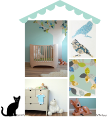
 Curious to know how I choose colours for kids’ rooms? Head on over to Lunamag.com, where I share my approach to choosing colours for children’s rooms as a children’s interior designer. It might not be what you expected!
Images: room to bloom
 Are you ready for this? Anna Kubel, the uber-talented photographer and stylist whose work I adore, has collaborated with one of my favourite wallpaper brands, Sandberg, to create a mini collection for children. The “Kubel Kids” range offers five patterns in a selection of colours created in collaboration with Anna. The imagery, as always, is stunning. Enjoy!

 The collection also comes with a set of accessories, including animal masks and a jumping jack hare. For more information, please visit Sandberg wallpaper.
Images: photography & styling by anna kubel for sandberg
 This month for Luna International, I’m focussing on storage solutions for kids’ rooms. You can’t have enough storage, right? Right! For tips and inspiration, see you over at Luna.
image: ikea
 I’m a little obsessed with green for kids’ rooms at the moment – all projects I’m currently working on feature green as either the main or an accent colour. It’s gender neutral, calming and versatile, combining beautifully with other colours – such as teal blue, lavender, pinks and blushes or ochre yellow to name a few. Green doesn’t have to be overly there: I love how in the above image, it features subtly in the wallpaper and is repeated in various shades with a painted chair and table. Stunning.
 In this room, green combines beautifully with teal blue – one of my favourite combinations. Note how the bedspread ties everything perfectly together, but how the dolls and some cushions create just enough discord.
 Another wonderful example of one of my favourite colour combinations in this vintage inspired children’s room: dark green accompanies dusky grey blue and dirty pinks. So so pretty.
 This eclectic kids room combines soft grey green – one of my favourite colours for kids rooms – with dusty pink. I love how the colourful boho rug stops the room from turning too pastel.
 Blue and green – but not as you know it. Note how the colours of mountains and sky are playfully swapped.
 I have a weakness for painted vintage furniture, and this green cupboard in a nordic playroom is pretty perfect.
 And finally, a sea green wall forms a strong background to hold the other rich colours in this sweet girl’s room. The dolls house is tonal perfection.
 My latest contribution to Luna is now online – it’s all about decluttering children’s spaces. For tips and my take on this tricky subject, hop over to Luna.
image: room to bloom
 Last weekend I visited Playtime Paris to get a flavour of new trends in the world of kid’s interiors. I had a lovely time talking to new designers and more established brands, and have highlighted some of the things that caught my eye above. Some old favourites, some new discoveries – enjoy!
Images from top left: 1. pompom petillant. 2. as before 3. little unicorn 4. camomile london 5. fabelab 6. mies & co (beautiful bedding!)
 Today I’m really excited to share a boy’s bedroom I designed a little while ago. This bright and happy space is Tobias’ room.

 Tobias had outgrown his cotbed and was ready to transition to a big boy room, so his parents called on me to create a fun and stylish room for him. To ensure the room would grow with Tobias, we kept the base neutral – a soft grey carpet, vintage grey blinds and light grey walls that sit easy with the rest of the house too. To add warmth to this cool palette, we used warm ochre yellow accents and timber.


 We introduced a light touch sky theme to complement Tobias’ love of all things Star Wars. Starry wallpaper offsets the house cupboards, and there are clouds, stars, a moon and raindrops to be found in the rest of the room – see if you can spot them all.


Most exciting for Tobias was of course the new bunk bed, which is the centre piece of the room. We dressed it with ochre and grey bedding and some nice cushions, as well as a string of cotton ball lights. Next to the bed is a bean bag for night time reading, plus a shelf and night stand for little treasures.


Finally, a small desk and chair with book ledges above finish the room – showcasing some of Tobias’ favourite books and trinkets.
For full sources please check my instagram account, here are a few highlights: oeuf bunk bed, moon print, ochre grey bedding, snake soft toy, abc print, bean bag, desk & chair, pirate bunny & bear cushions, apple print, cloud stickers, fox cushion, star wallpaper, house cupboards)
(images: design & styling by room to bloom, photography by brett charles, with thanks to nubie, scandiborn, camomile london, and molly meg)
 I was thrilled to see Charlotte’s room being featured in the April edition of The English Home. The article offers lots of expert tips on decorating children’s bedrooms, along with inspirational photos of beautifully designed kid’s rooms.


