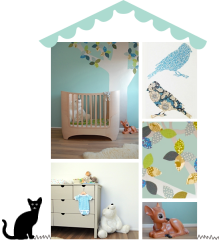
 Whoopee! I’ve written a feature for Absolutely Mama’s March issue with 5 ways to update you nursery for spring. These tips wont break the bank and are easy to implement… Pick up a copy or read the article here.
image: room to bloom
Today I’m super excited to share a bedroom I designed for a little girl called Marlowe. I had designed two of my client’s children’s bedrooms before, so I was thrilled to be working with her again.

The brief was to turn a smallish guest bedroom into a gorgeous room for a little girl. High on the wish list was a special bed, and Marlowe also asked or a den in her room. As the room was too small to fit both comfortably, I found a house shaped bed that could double up as a den. We painted it in a custom colour to fit with the rest of the scheme.
What I love about this bed are the windows with the fitted flower boxes… I had so much fun dressing this up with faux flowers and the little bird perching on the window frame. Because the back of the bed is open and sits against the wallpaper, inside it feels like a little room with one wallpapered wall.


 Looking at the rest of my client’s home and the orientation of the room, I created a tonal green scheme, backed by a beautiful floral mural wallpaper. Taking a cue from the warmer tones in the wallpaper design, I accented the room with blush and dusty pinks. I love how the blush curtains are offset by the cooler background.


 We added shelves in the alcoves with vintage style crates underneath for extra storage. The existing wardrobe worked well in the scheme, and we matched its colour to paint the bed. Under the bed, a plain blue-green rug grounds the bed and provides a soft play area.


 With the amazing feature floral wallpaper, I didn’t think the room needed much more on the walls, so I kept it simple with a swan bust and hooks underneath on the wall opposite the bed. Next to the bed I installed three lovely prints by Mrs Mighetto which had all the right colours to pull the scheme together. Inside the bed itself, a string of lighting creates a soft, playful atmosphere, with lots of cushions and pretty bedding to create a cosy nook.
Marlowe was over the moon with her new room – and her brother and sister were so impressed they wanted a bit of an update for their rooms too! For me the room was a dream to work on – my client has amazing taste and trusted me completely to create something beautiful. I hope you’ve enjoyed the result too!
Sources:
Bed & stool: Flexa via Nubie
Wallpaper: Sandberg
Posters & bird: Mrs Mighetto
Swan bust: Fiona Walker
Cat night light, soft toys, cloud cushion: Scandiborn
Bedlinen: Garbo & Friends
Star cushions & floral cushion: Molly Meg
Baskets: Olli Ella
Images: design & styling by room to bloom, photography by brett charles
Today I’d like to show you around Finn’s yellow and grey bedroom. I completed the interior design for his room at the same time as his baby sister Mia’s nursery. The rooms are very different, though both are based on a grey theme, working with the existing carpet and following the aesthetic of the rest of the house.

Finn’s parents wanted his new room to feel playful yet stylish. Having outgrown his nursery, the starting point was a new bed. We chose a house bed to add a playful touch to the room. These are a great choice for larger rooms, creating a “room within a room,” which feels cosy for little ones when moving to a bigger bed.
 To anchor the bed, we painted abstract mountains on the walls, zoning the sleeping area and optically reducing the height of the room. This is another way to scale down a large room for young children.
Next to the bed are easily accessible book ledges for night time reading, plus a basket for toys below. I love how the yellow basket and colourful books pop against the dark grey background. On the other side, a wooden play table is used for ‘tea parties’ and makes a great play surface.

 The wardrobe doors were painted two-tone like the mountains, so they meld with the background. To bring warmth to the scheme, I used light timber and yellow as an accent colour. Animal decor around the room adds a friendly note – a large giraffe from Finn’s nursery breaks up the grey walls.
Last but not least, industrial locker style cabinets offer lots of storage for toys and books, keeping the room look tidy. In addition, wall hooks and toy baskets make it easy to quickly clear the floor.

 I hope you enjoyed Finn’s room tour! If you feel inspired, here are some sources:
Grey toy baskets: Great Little Trading Company
Yellow basket: Muuto
Bear head: Kidsdepot
Lion cushion: Mr Fly
Throw: Baby Mori
Duvet cover: Liewood @Scandiborn
Dotty pillowcase: Ooh Noo
Star cushions: Numero 74 @Mollymeg
Yellow suitcase: Olli Ella
Lockers: La Redoute
Mouse table & chairs: NoFred
Bunting: Little GemGem @Etsy
Yellow bear poster: Atelier du Petit Parc
Bird & Bear print: Desenio
For further sources, please follow me on Instagram, where I tag lots of the products that I use in my designs x
Images: design & styling by room to bloom, photography by brett charles
Today I’m super exited to share a nursery that I recently designed for a baby girl. The brief was for a soft and feminine room, based on grey with powdery pink and warm blush tones.
 We created a tonal scheme, painting all woodwork the same colour as the walls in Farrow & Ball’s Cornforth White, toning with the grey carpet. To add colour and focus to the room, we used a gorgeous statement wallpaper behind the cot from Sandberg’s Kubel Kids collection. It wraps around one of the alcoves, where we installed display ledges to show off pretty books, art and toys.


 All furniture was kept grey, though we chose a cotbed with timber accents to add warmth. Slim metal legs on the dresser and wardrobe add a light, Scandinavian touch to the room. Throughout, natural timber accents and baskets soften and warm the scheme. The powder pink canopy above the cot ties in with the wallpaper to create a cosy nook. Little lights inside and golden stars on the outside add a magical touch.


 I hope you enjoyed this nursery tour as much as I enjoyed designing it!
Sources:
wooden animals: little acorns to mighty oaks
blanket: mori
doll’s pram & basket: olli ella
swan cushion, stars & canopy: molly meg
dolls & flower: boramiri
bunny head: fabels
alphabet print (in mirror): paintlove studio
grimm’s rainbow, abc blocks, bumpers: scandiborn
For further sources, please follow me on instagram, where I tag lots of the products that I use in my designs x
Images: design & styling by room to bloom, photography by brett charles
 Have you seen Hibou Home‘s dreamy new children’s bedding collection? I am a big fan of their children’s wallpaper range, so was super excited to find out Hibou has now launched a kids’ bedlinen range too.
 The floral design in pale rose has stolen my heart, closely followed by the light grey stars set – both would fit in so easily with many of my room designs, I can’t wait to style some of my new projects with them.
 The bed linen features simple little patterns reminiscent of the wallpaper designs, and comes in a pretty range of colours.
As you’d expect from a quality brand, all Hibou’s bedlinen is made from soft 100% organic cotton and OEKO TEX certified, so it’s safe for children’s skin and kind to the planet too.
images: hibou home
Today I’m super excited to share a green based woodland nursery design I completed a little while ago for a little girl. Oona’s bedroom is adjacent to her big sister’s room (which I posted about here), though much smaller. I really like small nurseries, they feel nice and snug and somehow fitting.

 The design brief was to create a cosy and beautiful nursery that worked well with the adjacent bedroom in terms of colour, as they are interconnected. Green is an accent colour there, so we decided to make this the nursery’s main colour, which also works well with the oak floor and aspect of the room. A beautiful whimsical woodland wallpaper design sets the tone and provides lots of detail to gaze at. The colours pull together the other finishes in the room.
 As there was limited space, we prioritised room for a cot and clothes storage. A vintage single wardrobe in dusty green blends with the background to keep things feeling spacious. The cot is a simple, open design in a similar tone to the floor, minimising contrast which helps the space feel calm. A two-tone wall creates a cosy corner and backdrop for the cot. To tone the yellow oak floor down a little, we used a light, bear shaped rug which provides a soft surface for play.

 For now, some floor cushions, a toy basket and a house shelf give Oona enough to play with. An small book ledge for favourite books is easily accessible. In the future, a cabinet or book shelf can be added to provide more storage.
The result is a calm yet fun to interact with space, that will adapt easily as Oona grows up.
images: design & styling room by bloom, photography by brett charles
with thanks to lidor: wooden animals, wooden alphabet blocks, maileg bunnies; and to wijs west: shoes
for further sources, please follow me on instagram, where I tag lots of the products that I use in my designs x
 My latest post for Luna is all about decorating children’s rooms when moving home. This can be a bit of a challenge, for example if the new bedroom is a very different size to the old one. As it’s a blank slate, there’s an opportunity to make it really special, but where to start? For tips and ideas, read more at Lunamag.com.
image: room to bloom
 Of course, the minute I posted my previous round-up of my favourite natural wood doll’s houses, I spotted this beautiful A-frame doll’s house by Such Great Heights – an on-the-spot new favourite. And I’m not alone: it’s sold out, but more will come in stock. Check out their other beautiful wooden toys too – love the truck and the doll’s chair.
images: such great heights
I’ve put together some of my favourite wooden doll’s houses for children’s rooms. I really love how they can be used to decorate a room – some of the dollshouses below feature in my children’s room designs.
I’ve chosen all wood ones, as I think these go with any scheme and don’t add more “noise”, but if you have an expensive dolls house and the colours aren’t right, why not paint it? The dolls house in Lola’s room used to be blue and pink, but it it fit right in after it was painted. Another idea is to use wallpaper on the inside of the house – using wallpaper samples or any pretty patterned paper, such as wrapping paper or Japanese paper. I’ll do a round-up of some of my favourite examples in a next post.
 sources: 1. plan toys victorian dolls house 2. zara small wooden house 3. olliella holdie house 4. john lewis leckford wooden dollshouse 5. ferm living funkis doll’s house 6. ikea flisat doll’s house wall shelf 7. ashburton dolls’ house kit


