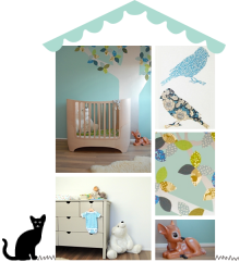
Mwah! I love xo-in my room‘s new candy circus cot in grey. But boy do I love their styling too.
Remember my mantra for nursery design – keep it simple? This image exemplifies what I mean by that. Of course this is a not real nursery, but you can keep your palette reduced – white with a whisper of grey, natural flooring – and let a feature wall or accent mural behind the cot take centre stage.
I love the combination of wallpaper patterns – artfully mismatched but unified by grey, and the contrast between pretty, delicate vintage florals and the unfussy, slightly raw look and feel of the cot. Well done Carina!
x
(image: xo-in my room)
I love Studio Ditte‘s wallpaper designs. You’ve probably come across their creations before – the scrapwood, robot, birdhouse and cars wallpapers for example. Though not all designed specifically for children, their wallpaper designs are eminently child-friendly and look great in kids’ rooms as an accent mural or feature wall.
In collaboration with BN Wallcoverings, Studio Ditte have recently released a new range of kids’ wallpaper inspired by toys of the past. The designs have a 1950s look and feel, with faded, aged colours and vintage style graphics.
The children’s collection includes small patterns using details from the main designs. It’s these that I find most appealing as they have a timeless quality to them – though they work beautifully with the main designs too. You can check out the full range here.
(images: studio ditte)
Number one on my clients’ wish list for kids’ bedrooms or playrooms is more space and less mess. Sounds familiar? Then read on.
The question I’m often asked is how achieve this. The answer, almost always, lies in clutter control and storage. January may be nearly over, but it’s never too late for your new year’s resolution to get organised and turn your child’s room into something special this year.
Lighten the load
So first of all – really, really try to lighten the load a bit – declutter. A good clear-out enables you to see the potential of the room, but an even more compelling reason is that a huge amount of toys and stuff crowds in on your child’s mental space! It overstimulates, drains energy and stifles the imagination. If you’ve spent lots of money on your child’s possessions or don’t want to appear ungrateful for gifts, then at least rotate what’s out on display, so everything gets a chance to be played with.
For those of you who are storing lots of your own possessions in your child’s closets – try and rehome your stuff elsewhere. It’s important that your child’s space is just that – a place to call their own.
Open vs closed storage
When addressing storage in your child’s bedroom, start with the big picture. Think about a mix of open and closed storage, but keep a good proportion behind doors. Invest in built-in storage if appropriate to the room, or buy a large free standing piece that will house clothes and toys (I love up-cycling shallow vintage wardrobes for this purpose). If space allows, consider buying two identical or compatible pieces, one for toys, one for clothes.
If your child’s bedroom is on the small side, look out for dual purpose furniture – beds and seating with drawers, desks with heaps of integrated storage – you know the drill. It may not look as cool as your favourite designer furniture, but you will be thankful as possessions accumulate.
Pack it up
Next, store loose small stuff in appropriately sized containers – trunks, boxes, suitcases, baskets, bags, jars. By “appropriate” I mean storing small bits in small boxes, not mixed in with larger items in huge trunks, which have to be turned upside down to get to things.
And now for the most important and easiest bit! To keep things looking calm, organised and lovely, try coordinating your containers a bit. Choose boxes in compatible styles, colours or materials, so you don’t create more chaos with a jumble of different sizes and colours stacked on top of each other (unless you know how to make that look chic). Don’t go for see-through boxes either, as this just looks messy (and ugly). Instead, label containers with text or images to tell them apart.
Keep floors free
Finally, keeping the floor free will make the room look more spacious – well, we can try. Use wall hooks and bags to store loose toys and hang up clothes. A cool looking laundry bin and paper basket will also help to keep the decks clear – repurpose unusual things like metal buckets or trunks for example.
Happy organising!
x Ursula
(images clockwise: green – 1. la maison d’anna G. 2. pure style home 3. kirsikkapuu 4. h&m 5. bungalow – blue – 1. stil 2. kast van een huis 3. cox and cox 4. maisons du monde – yellow – 1. bolig magasin 2. dezeen 3. dana van leeuwen 4. desire to inspire – pink – 1. the boo and the boy 2. lovely undergrad 3. berry red – timber – 1. red online 2. nonjetable 3. swoop bags 4. living etc – white – 1. weekday carnival 2. fancy house road 3. vitra)
Looking up one of Hibou Home’s children’s wallpaper designs for a new client, I happened upon this triptych of Hibou’s new children’s fabrics range. I love the subtle play of colours and the styling is super cute too.
The new designer fabric range complements Hibou’s wallpaper designs beautifully, but I think pattern like this works best if a little is used and given room to shine.
If you haven’t come across Hibou’s stylish wallpaper for kids (I doubt that very much as they have become hugely popular all over the world since their launch at the end of 2011), check out the full range on their website here.
You can read more about Hibou Home in an interview with founder Emma Lycett here.
Happy decorating!
x
I’m guest blogging again over at My Baba with some tips and advice on colour for your baby’s room.
As you know I’m all for venturing away from the more traditional, gender specific choices of pastel pink for girls and baby blue for boys. But hang on – do I spy a blue and pink theme in the collage above? Find out more on My Baba.
x Ursula
(images: kml design, stokke, helmen talossa, la redoute, oeuf)
Think vinyl flooring is ugly, cheap and boring? You’re right about the cost. There is however now a wide choice of good looking, modern designs that wouldn’t look amiss in a contemporary playroom, kids room, hallway, bathroom or kitchen. The above samples range from £25-£43 per square metre.
Hard-wearing, warm under foot and easy to clean, vinyl is perfect for families with children. It comes in rolls or tiles and is easy to install. A fantastic range of solid matt colours (including white and black!) is available from the Colour Flooring Company and Harvey Maria (who developed the dotty design above for Cath Kidston).
But my favourite design has to be a retro-patterned tile called Rose des vents from French homeware company Around The Wall. They remind me of scaled down cement tiles and I think they would look super sweet in a little ensuite. Around The Wall vinyl tiles are available in the UK from Zazous.
If your budget stretches, also consider lino or rubber flooring. I’ll be covering these in an upcoming post.
(top image: around the wall – 1. apple 2. red spot tile 3. rose des vents 4. raspberry pink 5. blue rose)
To create a soothing environment, have you thought about using contemporary grey instead of more traditional colours like blue or pink for a baby room?
I love how grey is lifted by white in this Scandinavian nursery, and accented with other soothing colours like blue, green and lilac to create a calming yet playful, modern space.
To decide whether grey is a suitable colour for the space, consider the room’s proportions, the quality of the light and how you’d like you and your child to feel in the room.
On its own grey can be quite draining, but it combines easily with many colours to counter this effect. Popular combinations for nurseries are grey with yellow accents (be careful not to use too much yellow near your baby’s bed as this may be too stimulating) or grey and pink. Darker greys work beautifully with pops of zesty colour like orange and lime.
Not all greys are alike – there are warm greys (yellow based) and cold greys (blue based). Combine them with colours from the same harmonious colour family to avoid uneasiness in the room.
Opinions are divided about the use of grey for a nursery or kids room. If you’d like to read more, there’s an interesting article on using grey in interiors by colour expert Karen Haller over on Stacey Sheppard’s interior design blog.
 So what is your verdict – would you use grey in a baby room?
x Ursula
(images: photography by mikkel adsbøl, styling katrine martensen-larsen via klm design)


