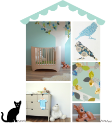
 Curious to know how I choose colours for kids’ rooms? Head on over to Lunamag.com, where I share my approach to choosing colours for children’s rooms as a children’s interior designer. It might not be what you expected!
Images: room to bloom
 As I’ve been drawn to greens, blues and teals of late, I thought I’d give you a round up of some of the lovely wallpaper’s I’ve considered for recent projects. Which is your favourite?
 This month for Luna International, I’m focussing on storage solutions for kids’ rooms. You can’t have enough storage, right? Right! For tips and inspiration, see you over at Luna.
image: ikea
 I’m a little obsessed with green for kids’ rooms at the moment – all projects I’m currently working on feature green as either the main or an accent colour. It’s gender neutral, calming and versatile, combining beautifully with other colours – such as teal blue, lavender, pinks and blushes or ochre yellow to name a few. Green doesn’t have to be overly there: I love how in the above image, it features subtly in the wallpaper and is repeated in various shades with a painted chair and table. Stunning.
 In this room, green combines beautifully with teal blue – one of my favourite combinations. Note how the bedspread ties everything perfectly together, but how the dolls and some cushions create just enough discord.
 Another wonderful example of one of my favourite colour combinations in this vintage inspired children’s room: dark green accompanies dusky grey blue and dirty pinks. So so pretty.
 This eclectic kids room combines soft grey green – one of my favourite colours for kids rooms – with dusty pink. I love how the colourful boho rug stops the room from turning too pastel.
 Blue and green – but not as you know it. Note how the colours of mountains and sky are playfully swapped.
 I have a weakness for painted vintage furniture, and this green cupboard in a nordic playroom is pretty perfect.
 And finally, a sea green wall forms a strong background to hold the other rich colours in this sweet girl’s room. The dolls house is tonal perfection.
 My latest contribution to Luna is now online – it’s all about decluttering children’s spaces. For tips and my take on this tricky subject, hop over to Luna.
image: room to bloom
 Today I am really excited to share one of my latest kid’s room designs. This is Benjamin’s bedroom, a Scandinavian inspired space mixing soft greys with white and natural timber, and a hint of blue.
A beautiful light oak floor and calming soft grey walls set the tone for this boy’s room. As Benjamin had outgrown his cot and was ready to transition, a new extending Oliver bed was the starting point when we started furnishing the room. We dressed it with tonal layers of grey bedding, adding texture with a cotton cuddle blanket and lots of cushions.


Next to the bed we installed a mouse chair and play table, which doubles up as a nightstand. A book rack above the table holds Benjamin’s books for night time reading, which we decorated with a whimsical moon mobile and feather hanger.

 Above the bed, an elephant and bear keep Benjamin company. Amy Oreo’s starlight print was a long time favourite of mine and Benjamin’s mum couldn’t resist it either.

 Behind the bed, a toy box and shelving offer space for toys and decorative items, creating a small play corner with bunting overhead. On the other side of the room, fitted cupboards and drawers offer more storage. A smiling moon keeps watch over Benjamin at night.
For full sources please check my instagram account, here are a few highlights: oliver junior bed, oliver book rack, no fred mouse chair & play table, camcam duvet set, mori blanket, numero 74 star cushions, fabelab bunny, elephant head, alphabet print, alphabet blocks, dot stickers, bear print, starlight print, bunting, boys rule print, big stuffed whale cushion, small cushions on toy chest, pompom toy bag, smiling full moon print, pinch toy cars, traffic rug, toy box.
(images: design & styling by room to bloom, photography by brett charles, with thanks to nubie, scandiborn, molly meg and mori)
 Today I’m really excited to share a boy’s bedroom I designed a little while ago. This bright and happy space is Tobias’ room.

 Tobias had outgrown his cotbed and was ready to transition to a big boy room, so his parents called on me to create a fun and stylish room for him. To ensure the room would grow with Tobias, we kept the base neutral – a soft grey carpet, vintage grey blinds and light grey walls that sit easy with the rest of the house too. To add warmth to this cool palette, we used warm ochre yellow accents and timber.


 We introduced a light touch sky theme to complement Tobias’ love of all things Star Wars. Starry wallpaper offsets the house cupboards, and there are clouds, stars, a moon and raindrops to be found in the rest of the room – see if you can spot them all.


Most exciting for Tobias was of course the new bunk bed, which is the centre piece of the room. We dressed it with ochre and grey bedding and some nice cushions, as well as a string of cotton ball lights. Next to the bed is a bean bag for night time reading, plus a shelf and night stand for little treasures.


Finally, a small desk and chair with book ledges above finish the room – showcasing some of Tobias’ favourite books and trinkets.
For full sources please check my instagram account, here are a few highlights: oeuf bunk bed, moon print, ochre grey bedding, snake soft toy, abc print, bean bag, desk & chair, pirate bunny & bear cushions, apple print, cloud stickers, fox cushion, star wallpaper, house cupboards)
(images: design & styling by room to bloom, photography by brett charles, with thanks to nubie, scandiborn, camomile london, and molly meg)
Once the girls’ bedrooms were completed, Lola and Heidi‘s parents asked me to help them decorate the rest of their home. These are play corners in two of the rooms I designed.
 To return the living room to calm after a day of play, we sourced a shallow vintage French armoire which was painted to fit with the scheme – a stylish way to hide toys, puzzles and board games. A toy box, vintage suitcases and assorted baskets provide further storage. The yellow apple print links in with the accent colour used in the rest of the living room.
 In the kitchen-dining room a house shaped chalkboard makes a fun background for a play kitchen and toys. This groups the toys together and makes them feel less lost in the space, but also gives the play area a more protected, snugger feel.
 (images: design & styling by room to bloom, photography by brett charles)


