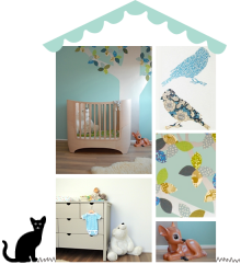
Today I’d like to show you another nursery that I completed a while ago. This grey baby room was for a sweet little boy called Tobias:
And this is what the room looked like before it became Tobias’ nursery:
Quite a difference, right? I’m super pleased how it all turned out, and more importantly – so are Tobias’ mum and dad : )
You can read a bit more about this project here.
(images: client’s & room to bloom, photography by brett charles)


Lovely! Very bright and light also love the subtle blue and pink accents.
Beautiful room! I love the grey with the splashes of red, and those cupboards are incredible!
Xxx
A wonderful transformation! A lovely calming nursery.
Hi Ursula!
This is beautiful!!!
I especially love the cupboards and Mifie the lamp.
What a beautiful transformation Ursula. Love those wardrobes and that grey wall. x
A gorgeous nursery a complete transformation! Toni x
What a wonderful blog with such great ideas.
Thank you for the inspiration!
Regards
Sanna/Farmhouse
Gorgeous room. What grey paint did you use please? Thanks
Hi Hailey – glad you like it 🙂 The dark grey is Farrow & Ball Pavillion Gray, the lighter walls are Farrow & Ball Great White.